Sage & Clay
Ecommerce · Web Design · Ecommerce · SEO
Illustrative work created by FloPixels; not a client engagement.
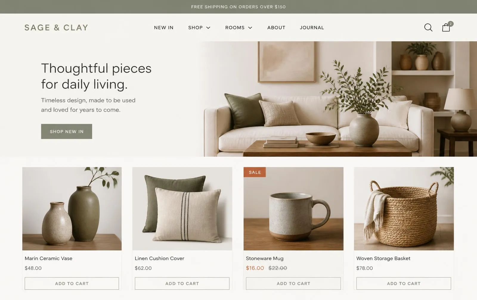
A calm ecommerce concept for a fictional homeware brand, with editorial product photography, clear pricing, and low-friction add-to-cart journeys.
Challenge
Make a small homeware catalogue feel considered while keeping browsing and checkout effortless.
Audience
Design-minded shoppers buying homeware gifts and small furnishings, mostly on mobile.
Visual direction
Warm off-white surfaces with sage and clay accents, generous whitespace, and quiet typography so products stay the focus.
Responsive experience
Two-column product grid on mobile with tappable add-to-cart and a sticky mini-cart summary.
Make a small homeware catalogue feel considered while keeping browsing and checkout effortless.
More frames
Closer views of the same concept homepage.
What would be measured
If this concept ran as a real engagement, these are the plans and intentions we would hold it to.
Strategy
- Let product photography carry the brand instead of decoration
- Keep the catalogue shallow so anything is two taps from checkout
- Use editorial content to support category discovery
Information architecture
- Home / New in / Shop by category / Rooms / Journal / Cart
- Category and product templates with consistent metadata
- Journal articles linking to relevant categories
SEO foundation
- Product and Offer structured data with price and availability
- Crawlable, canonical category facets
- Fast, lazy-loaded imagery for Core Web Vitals headroom
Conversion plan
- Add-to-cart on the grid, no forced product-page detour
- Clear shipping threshold in the header
- Persistent cart with visible item count
Intended outcomes
- Intended: higher add-to-cart rate
- Intended: better category discovery from editorial
Deliverables
- Sitemap, category and product templates, cart UX, photography spec
This is a concept project by FloPixels. It is not a paid engagement or endorsement, and no metrics represent actual business results.
Want a website that thinks like this?
Share the goal and the current state — we'll outline the clearest first step.